Your AI-generated poster may be colourful, dramatic, and technically impressive. It may also look strangely cheap.
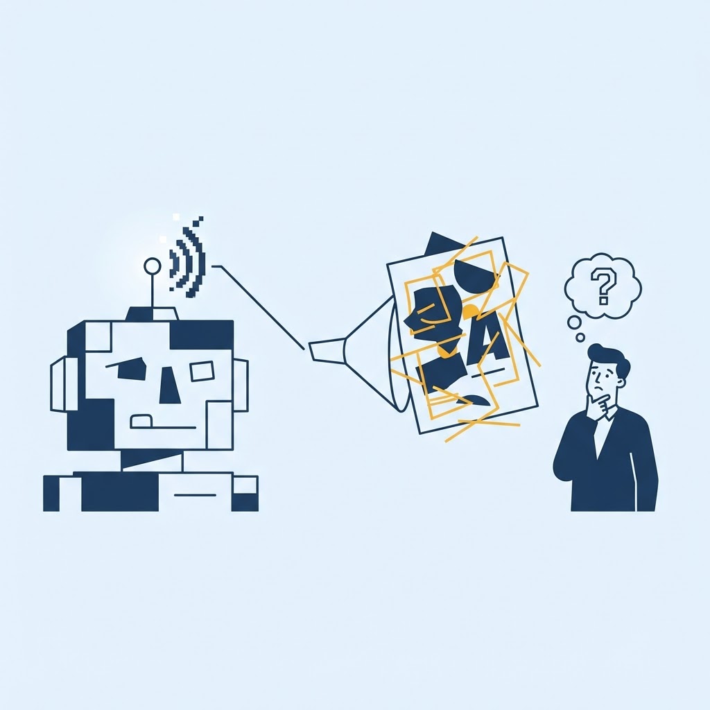
That contradiction happens because a poster is not just an image. It is a communication system. AI is good at producing visual ingredients; it does not automatically know which information a viewer must notice first, what the brand should feel like, or how the piece will work at its final size.
The image has style but no hierarchy
AI tools respond well to style words: cinematic, bold, minimalist, luxury, retro, neon. The result can look exciting in isolation. Then the event name, date, price, location, sponsors, and call to action are added, and everything fights for attention.
A good poster creates an order. The viewer should understand the main message from a distance, then discover supporting details as they move closer. If every element is loud, nothing leads.
The text is treated like decoration
Image generators may distort letters, invent words, or create text-shaped marks. Even template-based AI can write generic headlines and overfill the layout.
Generate the visual separately when possible, then typeset real text in a design tool. Check spelling, dates, phone numbers, addresses, prices, sponsor names, and legal details manually. One wrong digit can make the entire poster useless.
The design does not understand its environment
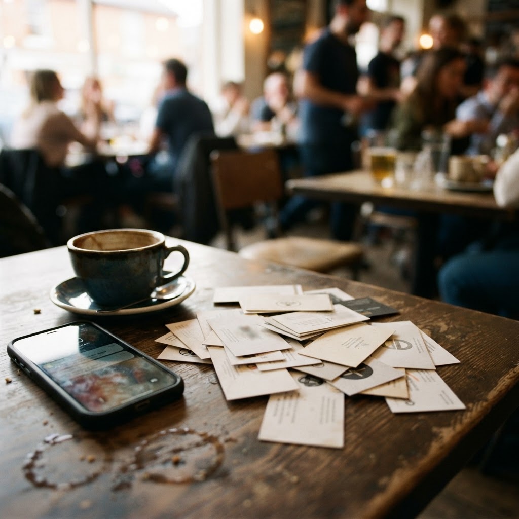
A poster viewed on Instagram is different from a poster taped inside a busy cafe. Screen size, viewing distance, lighting, paper, placement, and surrounding clutter all affect readability.
AI usually shows you a clean mock-up. It does not see the bulletin board covered with twenty competing flyers. Test the design at actual size and from the distance where people will encounter it.
It looks like everyone else prompt
Popular AI styles spread quickly. The same glossy gradients, impossible lighting, generic people, and exaggerated 3D lettering appear across unrelated brands. What looked original for a week becomes a visual cliche.
Bring in real material: original photography, local landmarks used thoughtfully, brand colours, actual products, human illustration, and language your customers recognize. Specificity is harder to copy than a style prompt.
Use AI for exploration, then design the poster
AI can create mood boards, rough compositions, background textures, headline options, and image concepts. Treat those as raw material. A person still needs to choose, simplify, edit, typeset, proof, and prepare the final file for print or digital use.
Before publishing, run a five-second test. Show the poster briefly to someone unfamiliar with it. Ask what it is, when it happens, and what they should do. If they cannot answer, the design is not finished.
Your AI poster looks bad when generation replaces communication. Use the speed, keep the judgment, and make the final piece belong to your business rather than to the tool that produced the first draft.
Prepare the final file properly
For print, confirm dimensions, bleed, safe margins, resolution, and the colour settings requested by the printer. For digital use, export the right aspect ratio and check compression on the actual platform. Keep an editable source file with licensed assets and real text. A poster can look correct in the editor and still fail because the final production details were treated as an afterthought.